Design-to-development handoff is one of the most common points of friction in product teams. Designs look complete, but once development begins, questions start to surface about flows, interactions, edge cases, and what’s truly final.
The problem isn't design quality or development capability. Why do design handoffs fail? Almost always because intent and implementation clarity aren't the same thing, and nobody built the bridge between them.
When key decisions aren’t clearly defined, developers are forced to interpret behavior, make assumptions, or constantly seek clarification. This leads to rework, slower delivery, and inconsistencies between design and the shipped product.
A strong handoff reduces guesswork. It ensures developers understand not just how a screen looks, but how it works. It is the last mile of the product design process and the first thing that determines whether that work ships the way it was intended.
This guide covers design handoff best practices focused on clarity, consistency, and workflows that help teams move faster.
“In one product team, designs were visually complete and approved before development began. Colors, typography, and spacing were all clearly defined. Yet within days, developers began asking fundamental questions: where certain actions led, what should happen when APIs failed, and whether specific screens were reusable or one-off. The issue wasn’t a lack of visuals; it was a lack of behavioral clarity. In another case, a simple change had a disproportionate impact. Screens were arranged linearly in Figma and connected using arrow connectors to reflect the real user journey. No additional documentation was added. Developer questions dropped immediately, because the flow was self-evident inside the design file itself.”
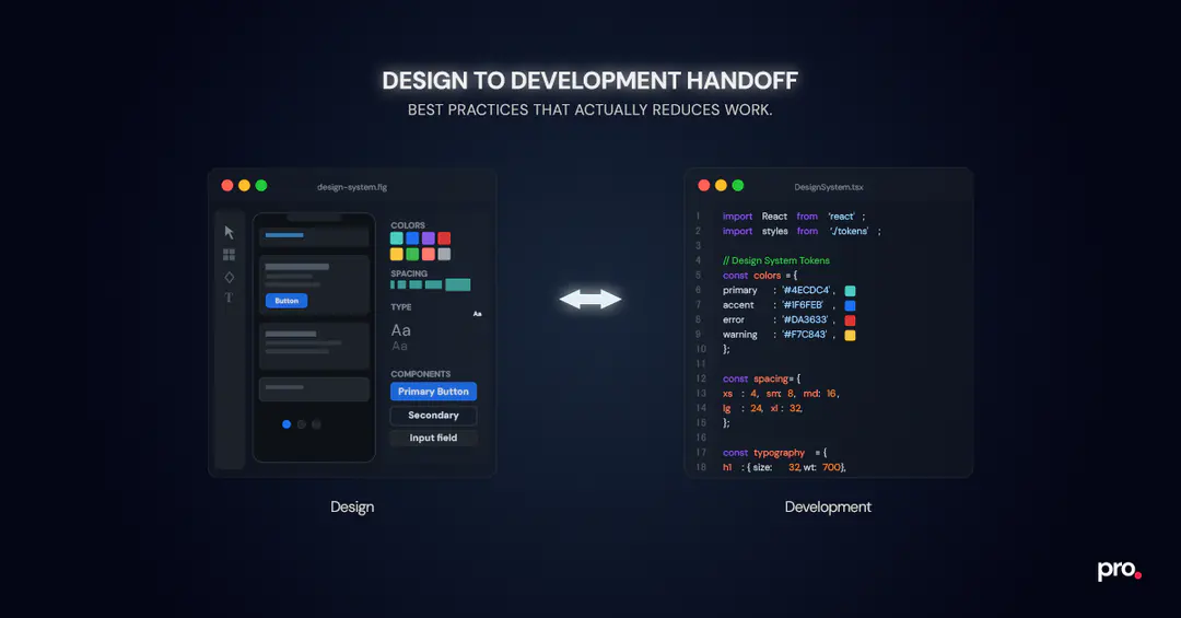
The Two Design-to-Development Handoff Phases Most Teams Overlook
One of the biggest reasons design-to-development handoffs fail is that teams treat them as a single event. In reality, effective handoffs happen in two distinct phases, each solving a different problem. Not separating these phases leads to avoidable rework during development. What should be included in a design handoff document depends entirely on which phase you are in: system-level definitions in the first, behavioral and flow clarity in the second.
Design System Handoff: Defining Non-Negotiables Before Development Starts
The first handoff happens at the start of a project and focuses on defining the design system. This establishes the visual and structural rules developers will follow throughout the product. While this initial handoff is the most intensive, it isn't a one-time exercise: as the product grows, the design system evolves with it, and each of those updates needs a clear communication loop between design and dev so changes don't get missed or interpreted inconsistently.
This handoff typically includes:
- Color palette (primary, secondary, semantic, neutral)
- Typography scale (headings, body text, captions)
- Spacing standards
- Icon set
- Core reusable components
Getting this phase right is what makes design systems genuinely useful in practice, not just a Figma library that sits untouched after the first sprint."
When these elements are clearly defined early, developers rarely need to ask questions about colors, typography, or spacing later. It also ensures consistency across features and helps new team members onboard faster without introducing visual drift.
Feature-Level Handoff: Translating Design Intent Into Buildable Behavior
The feature-level handoff process begins after a design is reviewed and finalized. This is where most developer questions actually arise.
At this stage, developers are usually not questioning visual choices. Instead, they need clarity on:
- User flows and navigation
- Interaction patterns
- Screen transitions
- Edge cases and non-happy paths
A strong feature-level handoff focuses on communicating how the product behaves, not just how it looks. Clear flows, annotations, and interaction details allow developers to implement features confidently without repeatedly switching context or seeking clarification.
Lock Design Foundations Early to Eliminate Repeated Developer Questions
Strong design-to-development handoffs start long before individual features are designed. Locking these foundations early ensures consistency and predictable implementation across all features.
These foundations should be defined once and treated as shared ground rules for the entire product.
Establish a Scalable Color Palette Developers Can Rely On
Establish a comprehensive color palette that includes:
- Primary and secondary colors
- Semantic colors such as success, warning, and error
- Neutral shades for backgrounds, borders, and text
Each color should be documented with its hex code, RGB value, and a short usage note, for example, when to use a semantic error red versus a neutral border gray. This context is what developers actually need to apply colors correctly, not just a swatch.
Providing developers with a predefined palette eliminates guesswork and ensures the correct colors are used consistently across screens and features. It also helps maintain a uniform visual language as the product scales and new designers join the team.
Define a Clear Typography Scale That Maps Cleanly to Code
Define a clear typography system with consistent jumps in:
- Font sizes (defined in px or rem)
- Font weights
- Line heights
Mapping these styles to clearly named roles such as H1, H2, body text, and captions creates a shared vocabulary between design and development. This clarity ensures typography is implemented accurately without developers needing to interpret visual differences.
Use a Consistent Spacing System to Avoid Layout Guesswork
Adopt a consistent spacing system, commonly based on fixed increments such as 4, 8, 12, and so on.
A predictable spacing scale helps maintain visual rhythm across the interface and allows developers to implement layouts without making subjective spacing decisions. Over time, this significantly improves UI consistency and reduces layout-related rework.
Standardize on a Single Icon System Across the Product
Specify a single icon pack to be used across the product. Common options include Material Icons, Lucide Icons, and Huge Icons, each with different visual weights and licensing terms worth checking before committing.
If custom icons are created, ensure they are clearly defined in Figma and easy to export. This avoids mismatches in icon style and prevents developers from sourcing alternatives that don’t align with the design language.
Locking these foundations early ensures that feature-level handoffs focus on behavior and flow, not visual interpretation. With the basics out of the way, teams can move faster and collaborate with far less friction.
Reusable UI Components: The Real Contract Between Design and Development
Reusable components are where design systems move from theory to execution. They act as a shared contract between design and development, ensuring that what gets designed can be built, reused, and scaled without deviation.
Instead of redesigning UI patterns for every screen, designers should define reusable components such as:
- Buttons
- Input fields
- Checkboxes and radio buttons
- Headers and navigation elements
- Common layout patterns
These components give developers a clear foundation to build on, reducing inconsistencies and speeding up implementation.
Document Every Component State, Not Just the Default
A component is only complete when its states are defined. Each reusable component should include designs for:
- Default state
- Hover or pressed state
- Active or selected state
- Disabled state
- Error or validation state (where applicable)
When these states are missing, developers are forced to make assumptions, leading to inconsistencies across the product. Clearly defined states ensure predictable behavior and a more polished user experience.
Why Reusable Components Reduce Rework and Speed Up Delivery
Well-defined components:
- Maintain UI consistency as the product grows
- Reduce duplication in both design and code
- Speed up development by encouraging reuse
- Make onboarding easier for new designers and developers
From a handoff perspective, reusable components dramatically reduce back-and-forth. Developers can focus on building logic and interactions instead of clarifying how basic UI elements should look or behave.
With strong reusable components in place, feature handoffs become simpler and more focused. The next step is ensuring those features are prepared correctly inside Figma for development.
Preparing Feature Designs in Figma for a Developer-Ready Handoff
Once foundational elements and reusable components are in place, the quality of a handoff depends heavily on how feature designs are prepared in Figma. This is where clarity around layout, structure, and intent makes the biggest difference for developers.
Use Auto Layout and Constraints So Developers Don't Have to Guess at Responsive Behavior
When auto layout and constraints aren't applied, developers lose the ability to inspect spacing and resizing behavior directly in Figma. That gap turns into clarification cycles and layout rework. This ensures designs:
- Adapt predictably to different screen sizes
- Communicate responsive behavior clearly
- Work effectively with Figma Dev Mode
When layouts are built correctly, developers can inspect spacing, alignment, and resizing behavior directly, reducing the need for manual explanations.
Frames Over Groups: What Goes Wrong When This Is Skipped
When screens are built with groups instead of frames, inspect values in Figma Dev Mode can be misleading, and spacing often gets read incorrectly during implementation. This is one of the more silent handoff issues: developers build what Figma shows them, which isn't always what the design intended.
Ensure that:
- Elements are contained within proper frames
- Vectors do not exceed frame boundaries
This prevents export issues and ensures developers can accurately inspect and extract design details without friction.
Naming Conventions That Help Developers Navigate Large Figma Files
Name screens, layers, and major repeating elements clearly. Meaningful naming helps developers:
- Navigate complex design files faster
- Select the correct layers for export
- Understand the purpose of each element without guesswork
Even a simple naming discipline can significantly improve handoff efficiency.
Using Figma Annotations to Reduce Context Switching During Handoff
Annotations play a crucial role during feature-level handoffs. Adding notes directly to the Figma file helps explain:
- Navigation logic
- Interaction behavior
- Implementation considerations, such as API dependencies
This reduces context switching between tools and allows developers to understand both design and intent in one place. It’s also important to recognize that tooling alone cannot solve handoff problems.
Dev Mode does not replace design thinking. While it helps developers inspect values and properties, it cannot explain why a flow branches, how edge cases should behave, or which states are intentional versus incidental. Clear intent still needs to be designed and communicated explicitly.
Preparing feature designs thoughtfully in Figma turns the handoff into a guided experience rather than a guessing game.
Common Design-to-Development Handoff Mistakes to Avoid
- Don’t rely on Slack messages or comments to explain core behavior. If something affects implementation, it belongs in the design file.
- Don’t assume Dev Mode replaces documentation. Inspectable values do not communicate intent, flow, or edge cases.
- Don’t hand off grouped layers. Groups break when screens scale, frames don’t.
- Don’t design only the happy path. Missing states force developers to invent UX decisions.
- Don’t leave responsiveness undefined. Ambiguity here always turns into rework later.
Designing for Edge Cases, Errors, and Non-Happy Paths
How to document edge cases for developers in Figma is one of the most searched but least answered questions in product teams. One of the most common reasons design-to-development handoffs break down is that designs only account for the ideal user journey, leaving developers to invent the rest. In reality, products spend a significant amount of time in non-ideal states, and if those aren’t designed upfront, developers are forced to fill in the gaps.
A strong handoff anticipates these scenarios and makes them explicit.
UI States Every Feature Design Must Include Before Handoff
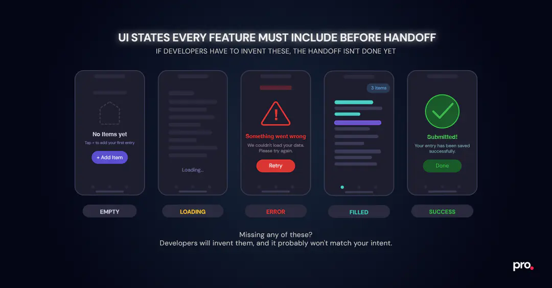
Designs should clearly include:
- Error states (validation errors, API failures)
- Loading states
- Empty states
- Filled or success states
- Network failure or retry scenarios
When these states are missing, developers must make assumptions that may not align with the product’s intended experience. This often leads to inconsistent behavior across screens and avoidable rework later.
Why Edge Cases Are a Daily Reality for Developers, Not Exceptions
Edge cases are not edge cases for developers; they are part of everyday implementation. Designing these states upfront:
- Reduces back-and-forth during development
- Ensures consistent UX across the product
- Prevents last-minute design changes during QA
By including non-happy paths in the design file, teams ensure that developers can implement features completely, not partially.
Making User Flows Obvious Inside the Design File
Even well-designed screens can be hard to implement if the user journey isn’t clear. One of the most effective ways to reduce misinterpretation is to make flows obvious inside the design file itself.
Arranging Screens Linearly to Reflect the Real User Journey
Placing screens in a linear order that reflects the actual user journey helps everyone - designers, developers, and product managers- understand how a feature works.
Using arrow connectors between screens makes navigation explicit:
- Where the user comes from
- What action triggers the next screen
- How different paths branch based on user input
This reduces the mental effort required to interpret the flow and prevents developers from misreading navigation logic.
Adding Navigation and Transition Context Directly in Figma
In addition to arrows, brief notes explaining transitions or conditional flows can remove ambiguity. Developers can immediately see how screens connect without needing separate walkthroughs or external documentation.
Teams that invest time in visualizing flows often see fewer clarification questions during development.
Organizing Figma Pages by Feature to Avoid Handoff Confusion
Allocate separate pages in Figma for each feature. This makes it clear where to find relevant screens and helps keep the design file manageable as the product grows.
Unused, experimental, or deprecated screens should be moved to separate pages (such as a playground or archive) to avoid confusion during handoff.
Making Responsive Behavior Explicit During Design Handoff
Responsive design assumptions are another common source of friction during handoff. If responsiveness isn’t clearly communicated, developers are forced to infer how layouts should adapt, often leading to mismatches and rework.
Showing How Layouts Adapt Across Breakpoints and Screen Sizes
Designs should include clear references for how layouts behave on different screen sizes. This can be done by:
- Showing key breakpoints
- Indicating which elements resize, wrap, or stack
- Clarifying what remains fixed versus flexible
Even lightweight references go a long way in aligning expectations between design and development.
Why Undefined Responsiveness Leads to Rework in Development
When responsive behavior is not defined, developers make reasonable but subjective decisions. Designing responsiveness upfront:
- Prevents inconsistent layouts across devices
- Reduces clarification cycles during implementation
- Ensures the final product matches the intended experience
Responsive design is not an enhancement; it’s part of the core handoff.
With responsiveness clearly communicated, developers can implement features confidently across devices.
The Future of Design-to-Development Handoffs in Modern Product Teams
While the fundamentals of a good handoff remain consistent, the way teams execute handoffs is evolving. Tools are becoming smarter, workflows more integrated, and expectations around speed and clarity continue to rise.
One area seeing growing influence is AI-assisted workflows.
How AI Is Starting to Assist With Design Handoff Workflows
AI is beginning to support design-to-development handoffs by reducing mechanical overhead rather than replacing human judgment. Practical use cases already emerging include auto-generating first-pass annotations from Figma files, summarising feature flows for developers, flagging missing states such as error or loading scenarios, and assisting with mapping design components to existing code libraries.
On a parallel track, Figma-to-code tools and plugins (Framer, Webflow, and others) are getting increasingly capable at converting well-structured Figma files into usable front-end code. For marketing pages and simpler interfaces, these can meaningfully speed up delivery. But there's a catch: they only produce clean output when the source file follows strong structural practices like auto layout, proper frames, and consistent naming.
Poorly organized Figma files generate equally messy code, regardless of how good the plugin is. For complex product UIs with custom logic, state management, and API integrations, these tools hit a ceiling quickly, and the handoff practices covered in this guide remain essential.
However, neither AI nor code-generation plugins can compensate for missing intent. If flows are unclear or edge cases are missing, these tools will accelerate the same gaps rather than fix them. Strong handoffs still depend on clearly defined systems and intentional design decisions.
Why Strong Design Foundations Still Matter More Than Tooling
Despite these advancements, AI cannot compensate for unclear design systems or poorly prepared files. Strong foundations - clear systems, defined flows, and thoughtful documentation- are still what make handoffs successful.
Teams that combine solid handoff practices with evolving tooling are better positioned to:
- Ship faster
- Reduce rework
- Maintain consistency at scale
Closing Thoughts: Design-to-Development Handoff as a Collaboration Checkpoint
A good design-to-development handoff is not a handover. It is a design developer collaboration with a clear structure, a shared source of truth, and no ambiguity left to chance. When done well, it removes ambiguity, aligns intent, and turns design files into a reliable source of truth.
By separating system-level and feature-level handoffs, locking foundations early, and making behavior explicit, teams reduce ambiguity at the source.
A good design-to-development handoff doesn’t explain everything; it removes the need to ask. If developers have to ask what happens next, the handoff isn’t done yet.
If you found this post valuable, I’d love to hear your thoughts. Let’s connect and continue the conversation on LinkedIn.

Brajkishor Baheti
CEO
Brajkishor (Braj) Baheti is the Co-Founder of Procedure Technologies, where he builds scalable systems -products, processes, and platforms that make complexity invisible. A Chartered Accountant by training, and a former risk advisor at EY and quant developer in capital markets, Braj brings deep financial context, structural thinking, and execution rigor to every system he builds. He has led teams across finance, education, healthcare, and operations, delivering enterprise software trusted for critical workflows. He also invests in early-stage startups as a Partner at Windrose Capital and still writes code when it matters.