
Users rarely measure how fast your application actually is. They remember how fast it felt.
We have all opened an application that technically loaded in two seconds but somehow felt slow and unresponsive. On the other hand, some products feel quick even though they wait for network responses just as long. The difference is not always the infrastructure. It is the perception.
As frontend engineers, we cannot eliminate every database query, third-party API call, or slow mobile connection. But we can control what happens while users wait. Modern frontend architecture is not just about reducing milliseconds. It is about designing the waiting experience itself.
This post covers three patterns that production teams use to make applications feel significantly faster: skeleton loading, Suspense boundaries, and predictive prefetching. Many of these improvements can be implemented primarily in the frontend, without first reducing the underlying API response time. All of them change how users experience the wait.
Why Loading Spinners Fail and Skeleton Screens Work Better
The default loading spinner has become the universal symbol for "please wait." But here is the problem: a spinner provides no context. It does not indicate progress. It does not tell the user what is loading, how much is left, or what the interface will look like when it is done. It just communicates that nothing helpful is happening right now.
Psychologically, this creates passive waiting. The user has nothing to process, nothing to anticipate, and nothing to interact with. They become fully focused on the delay itself. And passive waiting always feels longer than active waiting.
Think about airport baggage claim displays. People tend to feel less annoyed when they can see their bags moving on the belt, even if the total time they have to wait stays the same. Software follows the same principle: when users have something to look at, something that gives them a sense of progress and structure, the perceived wait shrinks.
This is why companies like LinkedIn, YouTube, and Airbnb have moved away from generic loading spinners entirely. Instead, they show layouts that resemble the final product while data loads in the background.
I experienced this firsthand while working on a React-based buyer-seller marketplace. Some of our listing pages initially relied on loading spinners while waiting for API responses. Even with reasonable response times, the interface felt slow because users had nothing meaningful to look at during that window. The problem was the waiting experience.
The goal is not to hide latency. It is to keep users mentally engaged while the application finishes its work.

How Skeleton Loading Reduces Perceived Latency and Layout Shift
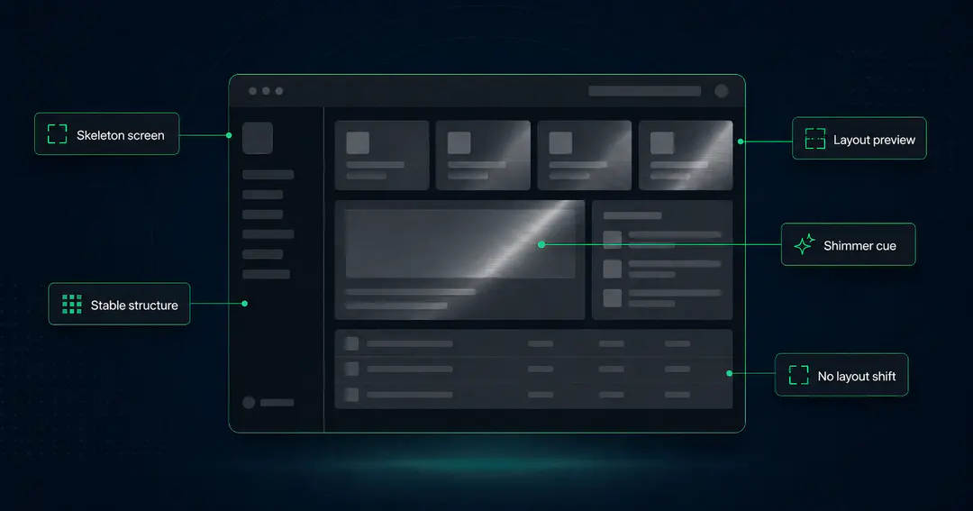
Skeleton screens are more than nicer placeholders. They are structural previews of the final interface, rendered before the real content arrives.
Instead of showing an empty screen or a spinner, a skeleton loader displays a rough version of the final UI: gray blocks where text will appear, placeholder rectangles where images will load, outlined shapes where buttons and cards will render. The user immediately understands three things: where the content will appear, how much information is loading, and what kind of interface they are interacting with.
This removes uncertainty. And uncertainty is one of the biggest contributors to perceived slowness.
Match Skeleton Dimensions to Prevent Layout Shift
Many skeleton implementations miss a critical detail: the skeleton must match the exact dimensions of the final component. Hardcoded or fixed widths, heights, and spacing prevent layout shifts once real data arrives.
This directly impacts Cumulative Layout Shift (CLS), one of Google's Core Web Vitals. When skeleton placeholders and final content have different dimensions, elements jump around as data loads in. Users click on the wrong things. The page feels unstable. A well-sized skeleton eliminates all of that.
In our marketplace project, this one change made a noticeable difference. We replaced the full-page spinner with skeleton cards that closely matched the final product listings: image placeholders at the correct aspect ratio, pricing blocks with reserved space, and action buttons positioned where they would ultimately render. The page felt more stable because users could anticipate where each element would appear.
Use Shimmer to Signal That the Interface Is Active
Adding a shimmer animation to skeleton loaders serves a specific psychological purpose. That subtle wave of lighter color sweeping across the placeholder tells users the application is still working. Without it, static gray blocks can look like broken UI or a frozen screen.
Movement reassures users that the system is active. It is a small detail, but it is the difference between "this app is loading" and "did this app crash?"
The benefit is not only visual polish. Shimmer distinguishes an active loading state from a frozen interface, while correctly sized placeholders keep the layout stable as real content arrives.
Using React Suspense for Progressive Rendering
Many React applications use one page-level loading condition, keeping the entire interface behind a single fallback until every required request has completed. The user sees nothing, then everything appears at once. This feels slower than it needs to, even when the total load time is reasonable.
Users do not care if your analytics widget or reporting table is still loading. They care whether they can start interacting with the primary interface. This is where React's <Suspense> boundaries become useful.
Instead of treating the page as a single large loading task, you break it into independent sections that can render on their own timeline:
- Render navigation immediately. It is static and requires no data.
- Load the primary call-to-action as soon as its data is ready.
- Stream in user-specific information next.
- Defer heavier widgets like charts, data tables, and historical logs until the critical interface is interactive.
This progressive rendering approach allows independent sections to reveal content on their own timelines, so users can interact with the most important parts of the interface before every request has resolved. In server-rendered React applications, Suspense can also work with streaming and selective hydration to make important sections available sooner.
I saw the impact of this clearly on a seller dashboard we built. The dashboard had charts, order summaries, and recent activity panels, each backed by separate APIs. Initially, the page waited for every single request to complete before rendering anything. When we restructured it to prioritize navigation, filters, and summary cards first while letting the heavier chart widgets load afterward, the dashboard felt dramatically faster. Users could begin interacting immediately instead of watching a blank screen.
The total load time did not change. What changed was when the interface became usable. And that distinction matters more to users than any Lighthouse score.
The fastest application is not always the one that finishes loading first. It is the one that becomes usable first.
Route Prefetching in React: Start Loading Before the Click
One of the simplest ways to improve perceived performance does not show up in Lighthouse reports. It happens before the user even clicks.
Most applications start fetching data only after the user performs an action. By then, you have already lost valuable time: the round trip to the server, the parsing, the rendering. Modern frontend applications can reclaim that time by predicting what users are likely to do next and quietly loading the data in advance.
Prefetching can prepare different kinds of resources: route code, server-rendered route payloads, API data, images, or the next page of a list. The right trigger depends on what the application needs and how confident you are about the user’s next action.
Some practical intent signals and prefetching patterns that work well in production include:
Viewport-based prefetching: When a product card scrolls into view, start loading the product detail data in the background. If the user clicks, the transition feels instant because the data is already available.
Hover- or focus-based route prefetching: When a user shows intent by hovering over or focusing a navigation link, begin loading the route or its data before activation.
Mousedown prefetching: Start the API request on pointer down rather than waiting for the full click event. This shaves off the time between mousedown and mouseup, which can be 100 to 150 milliseconds.
Scroll-ahead fetching: While users are still reading the current page of a paginated list, fetch the next page in the background.
We used route prefetching in our marketplace for frequently visited flows. When users browsed a product listing page, we began preloading the product detail page as soon as there were strong signals of navigation intent. By the time the user clicked, most of the required data was already available. The transition felt almost instant without touching any backend APIs.
Prefetching Has Real Tradeoffs
Prefetching is useful only when the probability of navigation justifies the cost. Every unused request consumes bandwidth, battery, cache space, or server capacity. On constrained mobile connections, speculative work can also compete with content the user has explicitly requested.
Prioritise high-confidence journeys. Moving from a product list to a product detail page may be predictable enough to justify prefetching. A dashboard with a dozen equally likely destinations usually is not.
Libraries such as TanStack Query and routing frameworks such as Next.js and React Router provide tools for prefetching routes and data. The harder decision is determining when the prediction is worth the cost.
Good prefetching feels invisible. Bad prefetching is work the user never asked the application to perform.
Why Perceived Performance Builds User Trust
Consistent feedback builds trust. When an interface responds immediately, even if some content arrives later, users can continue without wondering whether their action worked.
That confidence affects how people use the product. Users are more likely to continue a workflow, explore another feature, or complete an action when the interface feels predictable. Perceived performance is therefore not only a frontend concern. It is part of the product experience.
Milliseconds matter. But confidence matters more.
Make the Interface Usable Before Everything Loads
You cannot remove every slow API, third-party request, or unreliable mobile connection. But you can decide what users see, and what they can do, while those operations finish.
Start with the moments that create the most visible friction. Replace blank screens and full-page spinners with skeletons that match the dimensions of the final interface. Use Suspense boundaries to render navigation, primary actions, and essential information before charts or secondary widgets. Prefetch only when the user’s next action is predictable enough to justify the network cost.
The goal is not to disguise poor performance. It is to make progress visible and the interface useful sooner.
That also changes what teams should measure. Total load time still matters, but so does the time until the user can understand the page, trust that it is working, and take their next action.
These patterns do not eliminate latency. They make the wait structured, stable, and easier to trust. In practice, that is often what makes one application feel effortless while another feels slow, even when both finish loading at the same time.
We do this work with product teams — walking an existing React codebase screen by screen and deciding where boundaries, placeholders, and prefetch triggers actually belong. Follow along on LinkedIn for more from the team.
Retrofitting this is harder than it looks. By the time a team notices the app feels slow, loading logic is usually scattered across dozens of components with no shared convention.
Kanchandeep Kaur
SDE 2
Kanchandeep Kaur is a Software Development Engineer specializing in frontend development for web and mobile applications. She works with React, React Native, TypeScript, and modern API-driven architectures to build scalable, production-ready user experiences. Her work spans translating product requirements into intuitive interfaces, improving frontend performance, collaborating with product and design teams, mentoring engineers through code reviews, and solving complex production issues.