Summary
The project focused on designing end-to-end communication systems from scratch used in high-pressure emergency scenarios from control rooms to in-vehicle communication and on-ground responders. The work included designing three platforms: a dispatcher web app, an Android app for field teams, and an embedded in-vehicle platform. With no existing design references and complex workflows like priority-based calls and SOS handling, separate design systems were developed for each platform to ensure visual harmony and delivery speed. Interfaces were reviewed in simulated real-world conditions: motion, glare, and stress, to ensure usability held under pressure. This approach reduced development time and accelerated time-to-market by more than 6 months.
About The Client
MCLabs is a telecommunications company that builds mission-critical communication systems - software used in situations where failure can impact life, property, or national infrastructure. In mission-critical environments, timing isn’t just important; it is the boundary between control and consequence. Actions need to happen within strict deadlines, because delays or miscommunication can escalate into safety risks or operational failures.
Their products connect dispatch centres, field responders, and vehicle operators during incidents such as SOS alerts, on-track events, or crisis situations, ensuring information moves quickly, accurately, and without ambiguity. With a lean core team and deep domain expertise, MCLabs focuses on building communication tools that must remain reliable when the stakes are at their highest.
Country: India
Problem
MCLabs needed to make emergency communication smarter and more reliable. Existing systems provided minimal information, were less secure, and were based on technology that is becoming obsolete. For example, during railway incidents or field SOS situations, responders had to manually call dispatch, repeat their location over unstable networks, and wait for someone to acknowledge, costing precious minutes when decisions needed to be instant.
Scope
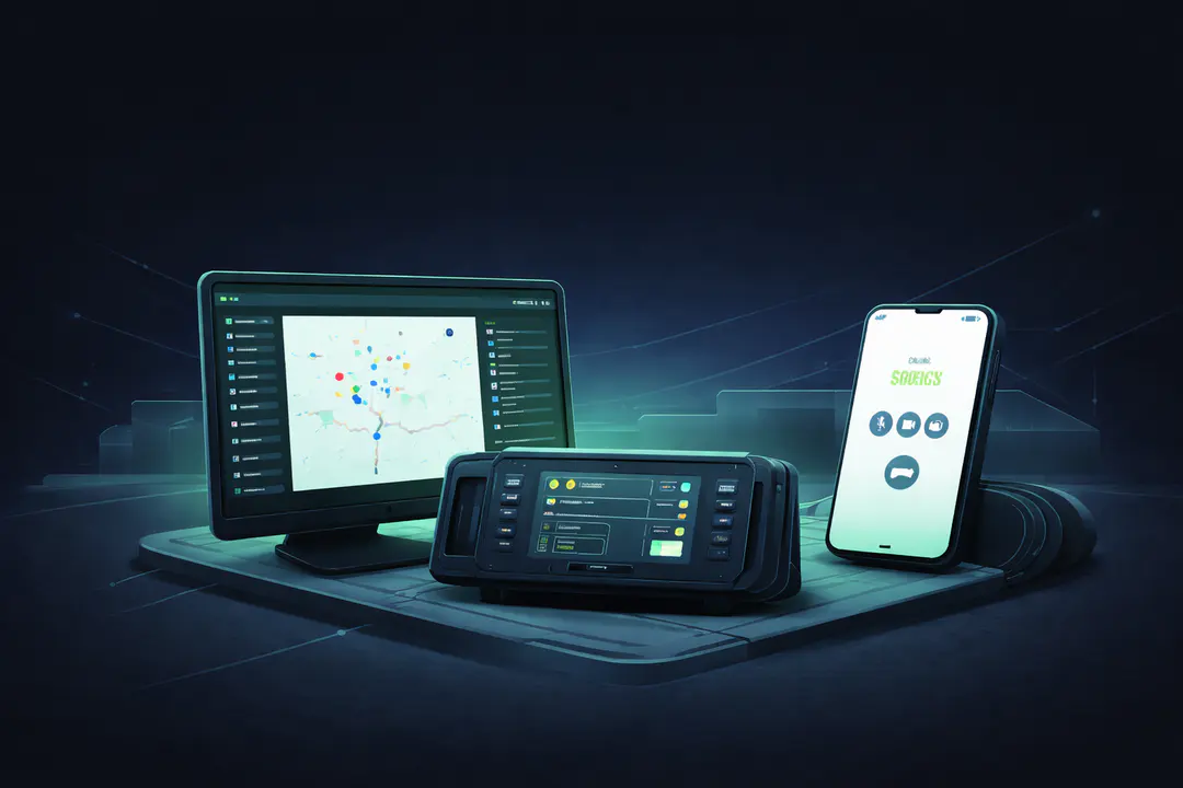
Designing three connected communication tools from the ground up - dispatcher web app, android app, and embedded in-vehicle platform. Each with its own design system, aligned for visual and interaction consistency across platforms.
Outcome
Three platform-specific design systems and end-to-end product designs across web, mobile, and embedded, designed with accessibility standards and validated via targeted simulations. Result: Faster development, smoother handoff with total project duration of ~4.5 months, and a 6–8 month reduction in go-to-market.
The Challenge
MCLabs had a clear vision of features, but needed them translated into usable emergency communication software. There were no modern benchmarks to follow - most existing systems were outdated, proprietary, or built only for fixed control-room setups. The interfaces had to work across very different environments: dispatch escalation in control rooms, SOS from field responders, and operator actions during active movement, each demanding fast, unambiguous interaction.
Complexity wasn’t limited to hardware or screen formats; it spanned priority call logic, accessibility, real-time use in emergencies, and more operational realities. Designing something reliable, fast to operate, and easy to understand, even in moments of stress, became the core challenge.
Our Approach
This engagement was a complete product design initiative, broken into three phases: Dispatcher, Android platform, and Embedded in-vehicle platform, but approached as one connected communication system. Instead of jumping into UI, we first mapped real scenarios with the client: SOS triggers, multi-party calls, call prioritization, and how these interactions change in motion or under stress.
From there, we built a minimal set of core screens to lock visual direction and interaction logic before expanding into full user journeys and edge cases. Separate, platform-specific design systems were established early, so components, colours, and behaviors stayed consistent across web, mobile, and embedded devices.
Core, complex flows were validated with engineers on representative hardware; we simulated real use to assess readability, reach, and recovery under motion. If it didn't work in the field, it didn't ship.
The Solution
We designed and delivered the Dispatcher web app, Android mobile app, and embedded in-vehicle interface end-to-end, each powered by a platform-specific design system with a shared visual language.
Complex communication workflows from priority-based calls and emergency overrides to SOS triggers, location sharing, patrol routes, and broadcast messaging were translated into clear, intuitive user journeys.
Interfaces were adapted to real working conditions: glove use, sunlight glare, vibration, limited touchscreen precision, and hardware button controls where needed. Accessibility, contrast, and information hierarchy were stress-tested rather than assumed.
Critical interactions were tested through scenario simulations and feasibility checks, while the client carried out on-device validation.
What We Built
We designed core emergency-response features end-to-end, prioritizing real-world clarity, speed, and escalation over surface-level aesthetics. Every decision was rooted in UX: creating intuitive flows, simplifying critical paths, and enabling developers to build faster through a strong, well-structured design system.
Priority calling (9+ types) with overrides:
Calls follow strict priority logic so an SOS or high-priority incident can pre-empt routine traffic. Visual and audio treatment make escalation unmistakable.
- One-tap SOS with auto-escalation: A single action triggers SOS. If it isn’t acknowledged in time, the system escalates through the defined chain - no operator micro-decisions required.
- Live location + patrol routing: Dispatch sees units in motion, can assign patrol paths, and reroute resources as situations change, useful for railway operations and public safety patrols.
- Broadcast and group communication: One-to-many messaging for events like derailments, fires, or security breaches, structured so critical updates cut through channel noise.
- Incident notes in flow: Field responders add quick voice/text notes without leaving core communication, so decisions and observations are captured as they happen.
- Multi-call handling tuned for stress: Queuing and acceptance rules reflect priority, with clear states for who’s connected, who’s waiting, and what happens next, designed to prevent error under pressure.
How We Built
We treated this as designing operations, not just screens - turning real incident behavior into clear, testable flows, then into platform-specific systems.
| Step | Process | Why It Mattered |
|---|
| 1. Mapped real incidents, not screens | Broke down real emergency scenarios with MCLabs: SOS from the field, dispatcher escalation, and fixed terminal client communication. Identified who acts first, what they must see, time-to-respond, and what happens if no one acknowledges. | Ensured design reflects how emergencies unfold in reality. |
| 2. Decisions before UI | Defined critical decision points: SOS vs call, interrupt vs queue, broadcast vs direct, before drawing screens. Turned these into user journeys. | Ensured logic supported crisis behavior. |
| 3. Built the riskiest flows first | Designed only the Dispatcher Call Control and SOS flows first. Reviewed them with the client before proceeding to other journeys. | These were the most failure-sensitive flows; if they didn’t hold under stress, nothing else would matter. |
| 4. Built 3 design systems (Web, Android, Embedded) | Created separate design systems for each platform: components, tokens, and layout behavior with a shared visual language. Codified accessibility: contrast ratios, tap targets, motion safety. | Respected the constraints of each device while keeping the system scalable, reusable, and accessible. |
| 5. Simulated real-world use | Tested core flows via simulations in moving vehicles, outdoor glare, tight response timing, and gloved interaction. Engineering feasibility aligned with MCLabs. | Validated the journeys by multiple discussions with the client to make sure the product holds under stress. |
| 6. Handoff with states, not just screens | Delivered annotated flows with defined states. Included edge cases and fallback logic. | Removed ambiguity for developers - no guesswork, faster implementation, fewer revisions. |
The Results
- Go-to-market timeline reduced by over 6 months
- Three platform-specific design systems with a shared visual language
- Interfaces built for real emergency use: clear, fast, and easy to operate under pressure
- Development moved faster with fully annotated screens, edge cases, and ready-to-implement design files
- Consistent documentation and version control, enabling smoother collaboration between design and engineering, aligned to device capabilities and rollout plans
- Teams reported shorter training time and fewer operational errors, as the system mirrors real on-ground workflows
The final products are faster to use, easier to adopt, and more reliable in control rooms, on moving vehicles, and in field operations.
- 6-8 months faster go-to-market
- 3 Products - Web · Android · In-Vehicle Embedded System
- 3 Design Systems - Platform-specific, built from scratch
- 100% Critical Flows - Designed for emergency use scenarios
Tech stack used
- Design & Prototyping
Figma for user flows, high-fidelity screens, and prototypes
- Design System
Reusable components, styles, and accessibility foundations
- User Flows & IA
Mapped scenarios, information architecture, and interactions
- Developer Handoff
Annotated screens, edge cases, and Figma Inspect files
- Collaboration
Weekly reviews, client alignment, and engineer sync-ups
- Field Validation
Tested in motion, glare, and on actual hardware
Why Procedure?
- Built for real-world complexity, not just screens
We design UX for environments where software can’t fail - moving vehicles, harsh sunlight, gloves, vibration, and pressure. With MCLabs, the goal wasn’t just clean UI, but building mission-critical communication systems that dispatchers, field responders, and vehicle operators could operate instinctively during emergencies.
- Consistent systems, platform-first
We built separate design systems for web, Android, and embedded - kept visually and behaviorally consistent to reduce rework and enable scale. This ensured consistency, reduced rework, and allowed MCLabs to scale faster across teams and future emergency communication tools.
- Speed without compromising reliability
Emergency communication software demands both speed and precision. We worked in tight feedback loops, documented every user flow and edge case, and provided developer-ready design files. This approach helped accelerate go-to-market by over six months, without sacrificing usability, accessibility, or technical feasibility.

 EdTech